Product Designer, Web
User Research
Interface Design
Graphic Design
BACKGROUND
Warframe is a free-to-play action role-playing third-person shooter developed by Digital Extremes. During my co-op at Digital Extremes, I got the chance to design Warframe’s year in review for new, current and returning players
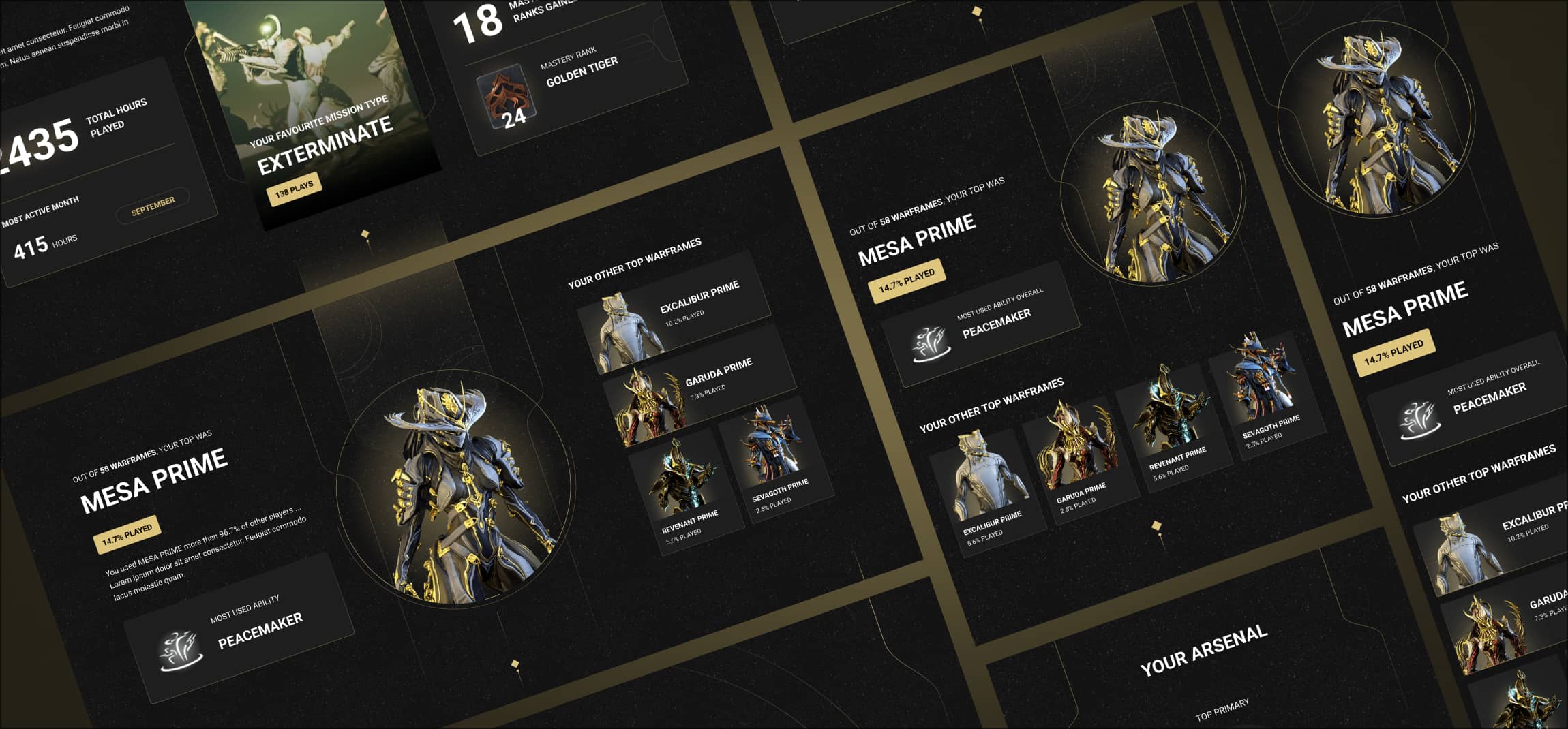
During my time working at Digital Extremes, The Warframe marketing team began a new project; “Warframe Your Year in Review”, a web project available on desktop, tablet and mobile that would showcase the statistics of various feats players would accomplish in the game in the year of 2024. 20 statistics were collected from statistics ranging from “total hours played” to “most used weapons”.
The primary goal of this project was to increase the engagement of new, active and returning players; as well as fostering shareability of these stats amongst the community, building excitement for the player base.

Types of Players

One of the challenges that came with designing for this player base was to create an experience where all these players would be satisfied and happy with their year in review.
These were the 3 primary player bases, however the “new player” bucket had further “edge cases” that needed to be addressed.

Initial low-fidelity sketches
These sketches were created to help decide the flow of the page, and in what order the user the user would see their stats. I first created one variation with no screen count limitations. However, after receiving the constraint of having 5-6 screens and the confirmed 20 stats, I created V2.
V1 Initial sketch


V2 sketch after given constraints and confirmation of statistics
The Flow of the Page

Visual Design
One of the things I wanted to highlight when creating the experience was the visuals. I really wanted to tie in many of the in-game elements of Warframe, such as core components to the gameplay. I was inspired by many of the game’s functional pieces that both new and experienced players would recognize, such scenes from their orbiter; the ship the player resides in during the game from the start.

In addition to that, I wanted to give the user a very “premium” feel when opening their personal stats, almost as if they were opening a treasure chest. I really wanted to emphasis that feeling of excitement. As a result, I decided to focus on using gold linework as key touchpoints in the design, This also tied in nicely with the overall Warframe brand, as it was something that was starting to become incorporated more onto the website and already existing in the game’s user interface.
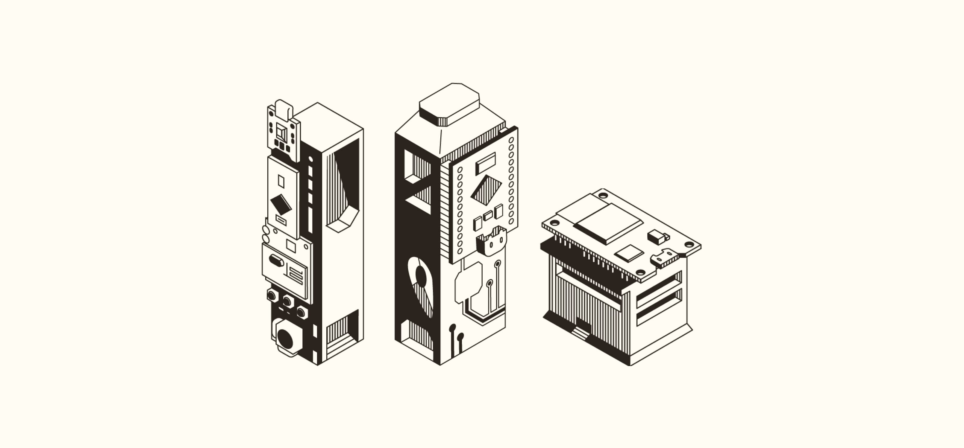
The Components
Using the concepts developed from the ideation phase, I created all visual elements of the page using Adobe Illustrator and Figma.
REPEATED ELEMENTS
These were elements that would be repeated throughout the experience.

MISSING DATA
These were cards that would replace areas of missing stats for players who don’t have them.

STARCHART
This star chart graphic is inspired by the in-game star chart which serves as the navigation system for all players.

ARSENAL
This graphic was inspired by the Arsenal, the place where players can equip their weapons and tools.

FOUNDRY
This graphic is inspired by the Foundry, the machine in-game where players can craft items.

4
The Solution
Animated Desktop Prototype
I used Adobe After Effects to create a short video to prototype the desktop user experience.
The Figma
This Figma file contains a view of all the screens created for this project in desktop, tablet and mobile views!